

Charts and history
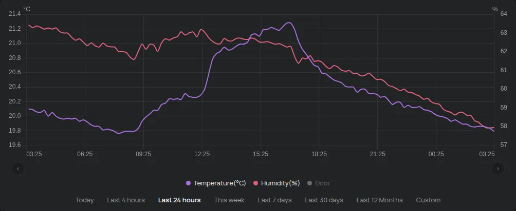
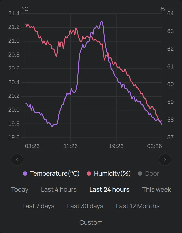
Each device has a chart with the history of its readings. The chart is on the device page, below the readings.
Change the time range
Section titled “Change the time range”Below the chart, click a range:
- Today, Last 4 hours or Last 24 hours,
- This week or Last 7 days,
- Last 30 days or Last 12 Months,
- Custom: select the start and the end.
The chart opens with Last 24 hours. The arrows on the left and right below the chart move the range earlier or later.
Custom range
Section titled “Custom range”- Click Custom.
- Select the start date and time.
- Select the end date and time. Now puts in the current time.
- Click Done.
Drag with the mouse or your finger on the chart to zoom in on a part of it. Click Zoom out to go back. Click a point on the chart to see the values at that moment.
The legend
Section titled “The legend”Below the chart, the legend shows the readings. Click a reading to show or hide it.
- The chart shows up to 2 units at the same time, for example °C and %. If you select a third unit, the first one is hidden.
- One reading always stays visible.
- Readings that accumulate, for example energy, show as bars per hour or per day. Other readings show as a line.
- Outputs show in orange, as on or off.
- A ▸ next to a reading shows a group of related readings. Click it to see the readings of the group.
When the range reaches the present, the chart adds the new values in real time.
Data detail
Section titled “Data detail”- Up to 7 days: the chart shows all the readings.
- Up to 5 months: the chart shows one value per day.
- More than 5 months: the chart shows one value per month.
For the exact values of a long range, make a report. If the chart has gaps, see chart gaps.
GPS chart
Section titled “GPS chart”On GPS trackers, the legend also has Map. The map shows the route only for ranges of up to 7 days. See map and GPS routes.
Compare many devices: the Data page
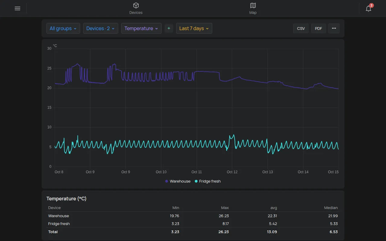
Section titled “Compare many devices: the Data page”The Data page shows the same reading from many devices in one chart. For example, it shows the temperature of all your fridges.
- Open the side menu.
- Click Tools > Data.
- In Group, select a group or all groups.
- In Devices, select the devices. Select all selects all the devices.
- Select the reading. The + button adds a second reading.
- Select the Range.
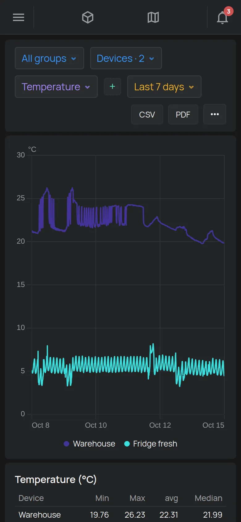
The chart shows one line for each device. Click a device in the legend to hide it.
Below the chart, a table shows for each device:
- the total, for readings that accumulate, for example energy,
- the Min, Max, avg and Median, for the other readings.
For ranges of more than 7 days, the values in the table are approximate and have a *. For exact values, make a report.
The CSV and PDF buttons download the data. The button with the three dots opens the Combined report. See reports.
The Data page is not available to guests.